
If you observe a busy street on a rainy day, a supermarket parking lot, or a contemporary interior design catalog, a stark visual truth emerges: color is fading away. Cars are gray, black, or white. Our clothes drape in muted beiges and understated monochromes. Our living rooms resemble pristine magazine spreads, stripped of any dissonance.
We are living in the era of the « Great Erasure. »

But what does this absence of contrast do to our minds? And what if color were not merely a superficial ornament, but the very expression of our vitality?
Measuring the « Great Erasure »
This sense of surrounding monotony is not merely a subjective impression. It has been scientifically proven. By analyzing over 7,000 everyday items from its collections—ranging from tools and household appliances to vehicles—spanning from 1800 to the present day, the Science Museum Group published a compelling quantitative study: color is vanishing from our daily lives. Warm tones, yellows, and reds have been progressively replaced by shades of gray, black, and white.
This Instagram post by RapTV illustrates this perfectly
As do the images in this post by @empire.abondance:
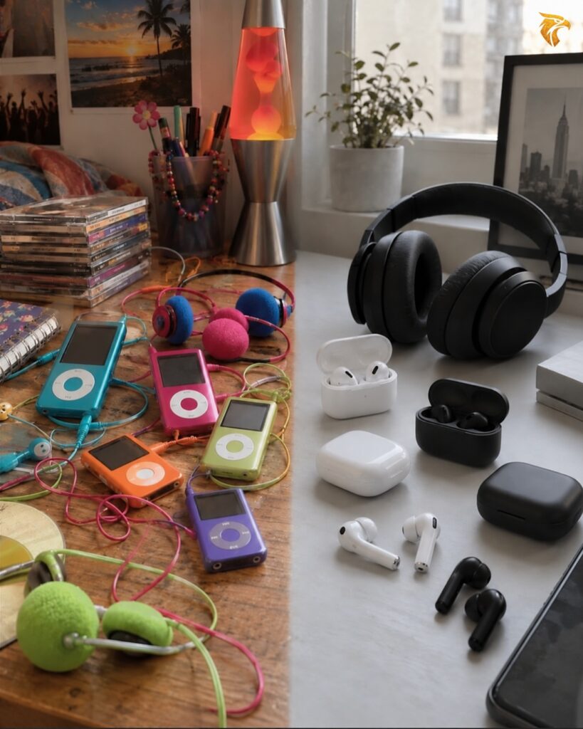
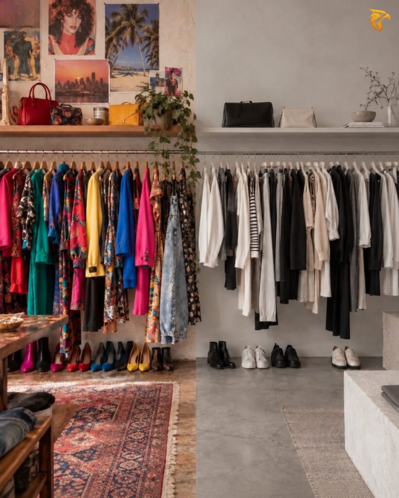
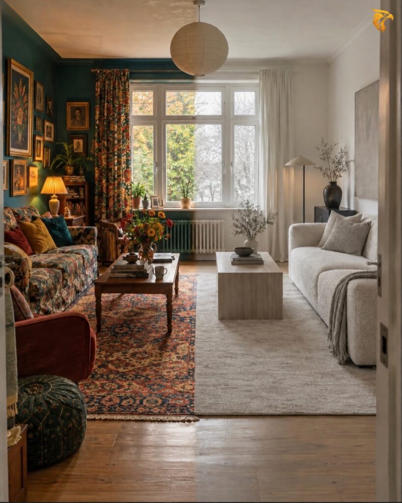
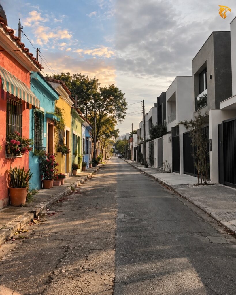

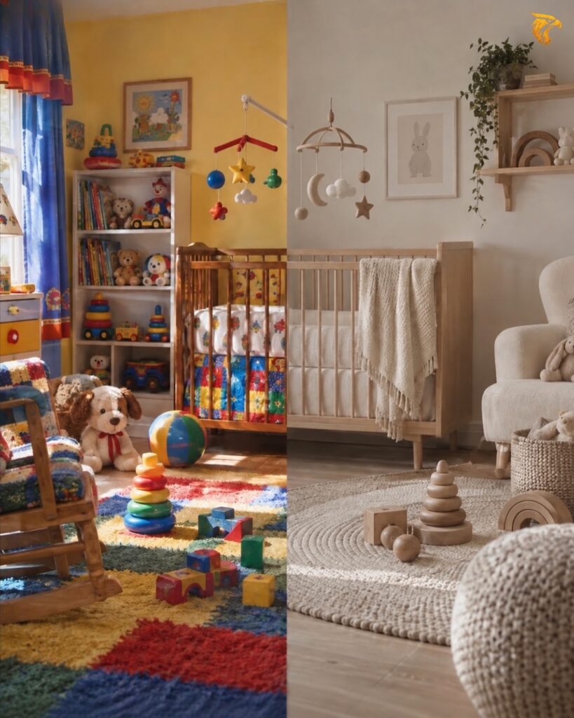
Why this sudden uniformization?
For industrial and logistical reasons, certainly, but also through a form of collective psychological surrender. Beige and white have become the gold standard of « chic » and « elegance. » They offer the absolute certainty of never committing a faux pas, of never being judged for daring. By retreating into these non-colors, many people purchase a form of social peace: the comfort of not disturbing, of making no mistakes.
The legitimate need for rest versus existential weariness
It would be unfair to entirely condemn this search for neutrality. Modern daily life is saturated with visual stimuli, notifications, and aggressive advertising. Faced with this cognitive overload, returning home to a beige, white, or light gray environment offers a form of therapeutic rest. The eye is no longer solicited, it clings to nothing, and the mind can finally lower its guard.
However, there is a fundamental difference between a deliberate sanctuary of rest and a global weariness where one no longer dares to live. Wearing gray or black every day under the guise of understatement can ultimately dim our own internal contrast.
Human beings were not born gray, beige, or black. We are woven of reflections, shifting emotions, and motion. Each of us harbors an inner palette that evolves according to our encounters, the mood of the times, and our states of mind. Dressing or surrounding oneself exclusively in chromatic emptiness is sometimes a way of masking this richness out of fear of overflowing.
Resisting through « unlikely » color: neuro-design in action
This is precisely where contemporary design plays its part. Introducing an « unlikely » or unexpected color at the inception of a creative project is not an act of gratuitous provocation. It is a vital intervention for the visual system.
Our brain operates through a mechanism known as the « salience network. » When everything is uniform, our attention goes dormant; the visual cortex shifts into power-saving mode, engendering boredom and disconnection. Introducing an unexpected hue sends a awakening signal directly to consciousness.
In this creative endeavor, there is no middle ground:
- Either the overall tone displeases and the color is deemed « too bold » (which proves it successfully disrupted the frame).
- Or an immediate resonance occurs: an intimate connection establishes itself between the artwork and the observer’s subconscious.
Daring an unlikely color proves that a visual identity or an object can resonate powerfully and exist authentically without blending into the market’s sea of gray.
Embracing your multidimensionality
The truth is that the human mind is complex and multifaceted. A brand identity or handcrafted piece does not need to confine itself to a single box. Designing soft, soothing harmonies for moments of quiet retreat, while crafting vibrant, audacious pieces to express vital momentum, is a true strength.
It means granting oneself permission to be multidimensional.
Today, many people have become disconnected from their own creative essence. Through lack of time, confidence, or sheer fatigue, they no longer dare to embrace color and settle into a passive, imposed aesthetic grayness. Reintroducing color into daily life—through a brand identity, a small object, or a piece of clothing—is an invitation to awaken that dormant creative spark. It means allowing your nuances to speak, reminding the world that beneath the smooth surface of modern trends, our inner realm burns with a thousand fires.

Do you ever feel like you’re taking refuge in the safety of beige, gray, or white out of a fear of making a mistake, or out of a genuine need for calm? What is the « unlikely » color you dream of daring to introduce into your home or visual identity? Share your thoughts in the comments—I look forward to reading your reflections and exchanging with you!